EN · Display Italic
Manor
為精油芳療品牌打造的全方位平台——把身心靈課程、靈性卡牌商城與會員系統,整合進一個溫暖療癒的數位空間。
A full wellness platform for an aromatherapy brand — body-mind courses, a spiritual card shop, and a membership system, woven into one warm, healing digital space.
希爾芳園(H. Manor)是一個精油芳療與身心靈品牌,提供精油產品、靈性卡牌,以及線上身心靈課程。 品牌的核心是「療癒」——透過植物的力量與課程的引導,陪伴學員照顧自己的身心。
專案開始時,品牌的銷售分散在不同管道:課程報名一套流程、卡牌販售另一套、會員資料又在別處。 每多一個管道,就多一份手動核對的工作。品牌需要的不只是一個「商城」, 而是一個能把商品、課程、會員整合在一起的完整平台——同時保有品牌溫暖療癒的氣質。
這是整個專案的設計方針:功能面是一個電商平台,體驗面卻要像走進一間芳療教室。
H. Manor (希爾芳園) is an aromatherapy and wellness brand offering essential-oil products, spiritual cards, and online body-mind courses. At its core is healing — using botanicals and guided courses to help members care for body and mind.
When the project began, sales were scattered across channels: one flow for course sign-ups, another for card sales, member data somewhere else again. Every channel added another round of manual reconciliation. What the brand needed wasn't just a shop — it was one platform that unifies products, courses, and membership, while keeping its warm, healing character.
That became the design brief: functionally an e-commerce platform, experientially a walk into an aromatherapy studio.
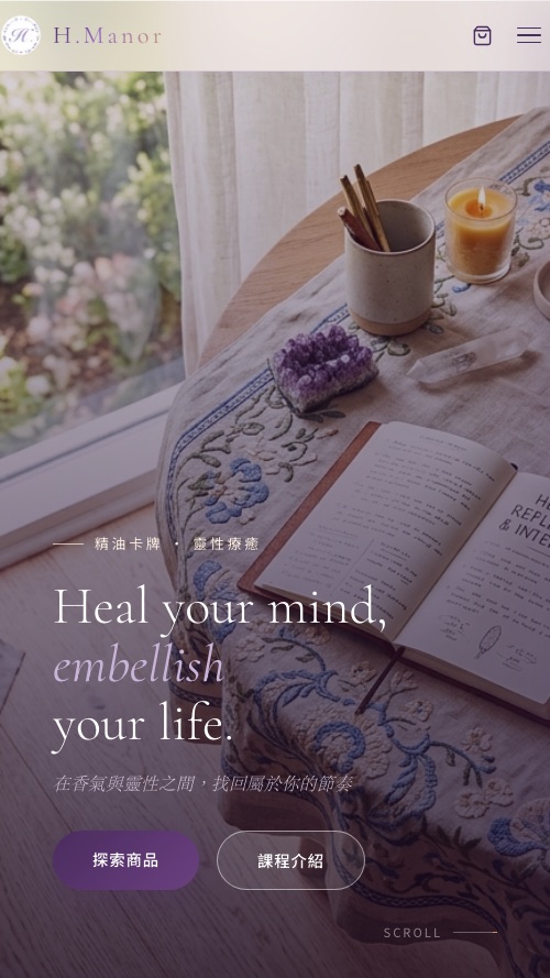
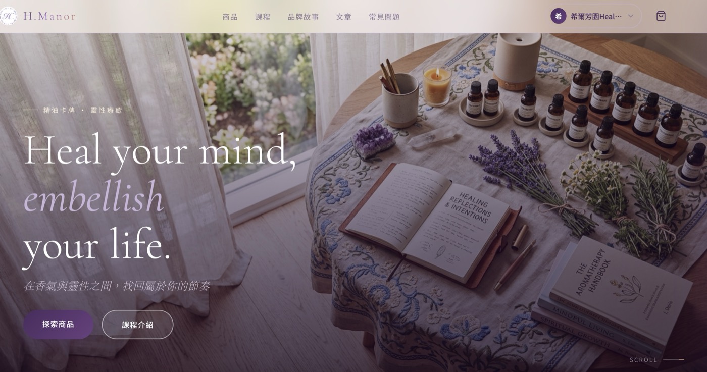
多數電商為了轉換率,把畫面塞滿促銷與倒數;希爾芳園走完全相反的路。 整體視覺以「走進芳療教室」為氣氛核心:溫暖的米白底色取代電商常見的冷白, 以植物與精油的實景攝影為主角,輔以薰衣草與草本的柔和色調,留白讓畫面能呼吸。
字體延續品牌的溫柔語氣:英文以纖細的襯線體斜體呈現品牌語句(Heal your mind, embellish your life), 中文用宋體的細字重Light承接,即使是商品價格與按鈕,也刻意降低視覺音量,不打斷療癒的節奏。
資訊架構上最關鍵的決定:把「商品」「課程」「品牌故事」放在同一層,而不是把課程藏在商品分類裡。 對這個品牌來說,課程不是附加商品——它就是品牌本身。導覽的每一步都在告訴訪客:這裡賣的是一種生活方式。
Most e-commerce fills the screen with promos and countdowns; H. Manor goes the opposite way. The mood is "walking into an aromatherapy studio": a warm cream base instead of cold commerce-white, real photography of botanicals and oils as the hero, soft lavender and herb tones, and whitespace that lets the page breathe.
Typography keeps the brand's gentle voice: a delicate serif italic carries the English brand lines (Heal your mind, embellish your life), echoed by a light-weight Chinese serif. Even prices and buttons are turned down in visual volume, so nothing interrupts the healing rhythm.
The key information-architecture call: products, courses, and brand story sit on the same level — courses are not buried inside a shop category. For this brand, courses aren't an add-on; they are the brand. Every step of the navigation says: what's sold here is a way of living.
這個案子的內容型態特別多元:實體商品、靈性卡牌、線上課程、文章,每一種的欄位結構都不同。 所以我們選擇 Next.js + Sanity CMS 的 headless 架構——在 Sanity 為每種內容量身定義模型, 品牌方在同一個後台上架商品、發佈課程、寫文章,前台自動同步。
前端用 Next.js 的原因很實際:商品與課程頁需要好的 SEO 與載入速度, 會員與課程觀看又需要應用程式般的互動。Next.js 讓兩者共存在同一套架構裡。 部署在 Vercel,每次改版都有預覽網址,與品牌方的確認往返變得非常輕快。
The content here is unusually varied: physical products, spiritual cards, online courses, articles — each with its own field structure. So we went headless with Next.js + Sanity CMS: content models tailored per type in Sanity, letting the brand publish products, courses, and articles from one studio while the front-end stays in sync.
Next.js was a practical choice: product and course pages need strong SEO and fast loads, while membership and course viewing need app-like interactivity — one framework covers both. Deployed on Vercel, every revision ships with a preview URL, keeping client review rounds light and fast.
上線後,原本分散在各管道的銷售終於收攏到同一個地方:訪客在同一個網站認識品牌、購買卡牌、 報名課程、登入會員回看內容。品牌方透過 Sanity 後台自主經營全部內容, 不需要每次更新都回頭找工程師。
After launch, sales that once lived across scattered channels finally converged: visitors meet the brand, buy cards, join courses, and log in to revisit content — all in one place. The brand runs every piece of content independently through Sanity, no engineer required for routine updates.