EN · Display Italic
Light
為精神醫療人權倡議的非營利組織打造形象官網——讓求助的人快速找到資源,讓沉重的議題被溫柔地看見。
A brand site for a mental-health human-rights nonprofit — helping those in need find resources fast, and giving a heavy subject a gentle, dignified voice.
中華公民人權協會(CCHR Taiwan)是關注精神醫療人權的非營利組織, 提供免費法律諮詢、案例記錄與公民教育資源,陪伴在精神醫療中受侵害的人與家屬。
這類議題的網站有一個天生的兩難:太官方,求助的人不敢靠近;太柔軟,議題的份量又立不住。 而會來到這個網站的人,往往正處在最脆弱、最需要被接住的時刻。 網站要做的不是華麗的品牌展演,而是一個清楚、可信、溫暖的入口。
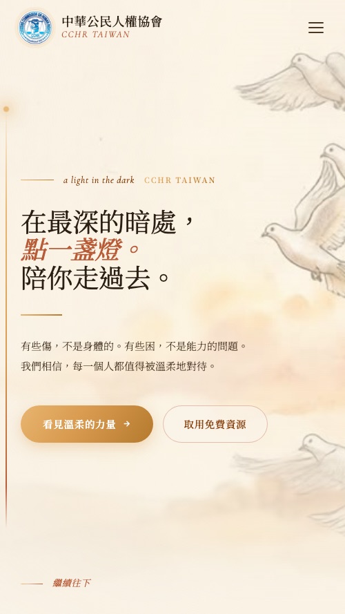
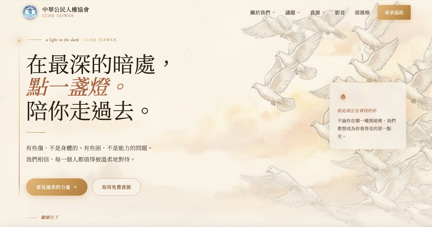
這是協會網站的主標語,也是整個設計的方針:網站本身,就該是那盞燈。
CCHR Taiwan is a nonprofit focused on human rights in mental-health care — offering free legal consultation, case documentation, and civic education for those harmed within psychiatric systems and their families.
Sites on subjects like this face an inherent tension: too official, and people in need won't approach; too soft, and the issue loses its weight. Visitors often arrive at their most vulnerable moment. The site's job isn't brand theatre — it's a clear, credible, warm doorway.
That's the site's own headline, and it became the design brief: the website itself should be that lamp.
刻意避開 NGO 網站常見的制式藍與冷灰。整體視覺以「一盞燈」為核心: 溫暖的紙色基底像一封手寫的信,鴿子與光的插畫意象貫穿全站, 琥珀橘作為「光」的點綴色——出現在每一個求助入口上。
字體以宋體細字重Light為主,標語用較大的級距慢慢讀;內文行距放寬, 讓沉重的內容有呼吸的空間。所有「尋求協助」的按鈕都用琥珀色實心呈現——在整頁的柔和裡,一眼就能找到。
資訊架構的核心決定:把「求助」放在第一層、每一頁都能抵達。 議題說明與案例記錄負責建立信任,但無論訪客讀到哪裡, 「免費法律諮詢」的入口永遠在一步之內。
We deliberately avoided the stock NGO blue-and-grey. The visual core is "a lamp": a warm paper base like a handwritten letter, dove-and-light illustration motifs throughout, and lamp-amber as the accent of "light" — appearing on every help entry point.
Typography leans on a light-weight Chinese serif, with headlines set large and slow; body text gets generous leading so heavy content can breathe. Every "get help" button is solid amber — instantly findable within the page's softness.
The key information-architecture call: "Get help" lives at the top level, reachable from every page. Issue explainers and case records build trust — but wherever a visitor is reading, free legal consultation is one step away.
對倡議型組織來說,網站最重要的技術指標是被找到。 正在搜尋「精神醫療 權益」「強制住院 諮詢」的人,應該在搜尋結果裡遇見協會。 所以這個案子以 Next.js 建構、靜態生成頁面,把 SEO 基礎(語意結構、Meta、OG、載入速度)做滿。
同時,考量到訪客可能在手機上、在深夜、在情緒低谷裡打開這個網站—— 頁面刻意保持輕量與快速,沒有厚重的動畫與彈窗,部署在 Vercel 上全球加速。
For an advocacy organization, the most important technical metric is being found. Someone searching for psychiatric-rights terms should meet the association in the results. The site is built with Next.js, statically generated, with SEO fundamentals — semantic structure, meta, OG, load speed — done thoroughly.
And since visitors may open this site on a phone, late at night, at a low point — pages stay deliberately light and fast: no heavy animation, no popups, globally served on Vercel.
上線後,協會第一次有了一個能完整代表自己的數位入口: 議題是什麼、協會做過什麼、需要幫助時該找誰——三件事在同一個網站上說清楚。 乾淨的 SEO 基礎也讓議題內容能持續累積自然搜尋的能見度。
For the first time, the association has one digital doorway that fully represents it: what the issue is, what the organization has done, and who to reach when help is needed — all told in one place. A clean SEO foundation lets its advocacy content keep compounding organic visibility.